
Whether you are trying to create images, backgrounds or textures then you need to know about color trends. If you want to remember one thing from this post, remember the word Pantone as searching for Pantone will help you find what colors will be popular in the future.
What is Pantone?
The Oxford Dictionaries describe pantone as a system for matching colors, used in specifying printing inks.
It gives each color produced a Pantone number which can be used to replicate that color exactly. It is used by designers of all types. You may have seen it on color charts for paints when you are looking to decorate your bedroom, but fashion designers also use them and textile creators. This system was created by the Pantone LLC who are is based in the USA but influences color worldwide.
Why Are Pantone colors so important?
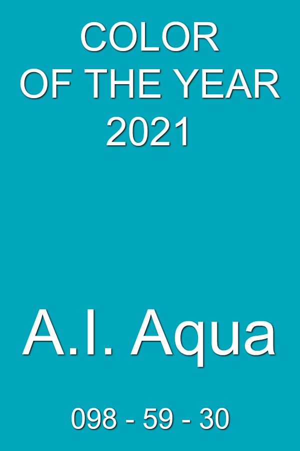
First, did you know Pantone produces a color of the year? Even if you didn’t, you have seen it in use for goods in that year. In 2019 it was living coral, and in 2020 it is classic blue. Next time you look for clothes or cushion covers or kitchen accessories, see what colors are in vogue. It looks like 2021’s color is Aqua.
Second, the other major trend setters in color are the London and New York fashion weeks. Each year, the colors used by designers are converted into Pantone colors and the design world uses these colors so your mug, hat or lingerie are in fashion.
I’m a journal and planner designer, so what’s this to do with me?
One thing we know about life is that the majority of people buying products will follow trends. Okay, not all, but you can still use the colors for them.
Let us say the color of the year is Bright Orange, then the major designers will create journals, kettles and water glasses in orange. You should too, but with a twist. You may not want to make it all orange, but you can use it as an accent color. Look for the complimentary color for that shade of orange and base your covers on that color. Then a button or clasp, or the tab colors, or even stickers in the orange may be all that’s needed.
If your audience loves Victoriana or Steampunk, use a subtle form of orange to give it an up-to-date twist. To make it subtle, decrease the transparency or use a tint of the orange.
If you are selling coloring or activity books, make the background color of the front or the spine in the orange–have a play.
If you look at the fashion week colors, do the same with them and have a play. Create covers and internals that are in the colors of the moment. In six months’ time, change from Spring Colors to Fall (Autumn) Colors or visa versa and with a small amount of work, you can be trendy again. If you use Di Hueser’s PlugIns, this will be so easy as you can change font colors and tabs in 20 minutes or less.
Link to Di’s site – yes it is an affiliate link! https://plrplanners.com
Where can I find the colors?
I would suggest the following
- For current colors, just use your favorite search engine–look for Pantone Color Of the Year and New Your and London Fashion Week Colors.
- Do a Google alert for them so you are notified when new colors come out. Yes, you will get a lot of rubbish BUT, you will also get the colors without having to remember to search.
I hope this has inspired your creativity and please email me your design results.
Marian.